
When I was little, my Dad and I went througha phase of working on the family tree; filling in dates of birth and locations on a large piece of card that we would extend with extra sheets when we added too many names.
More recently, I've used Ancestry.co.uk and other genealogy websites to fill in some of the gaps and add more details.
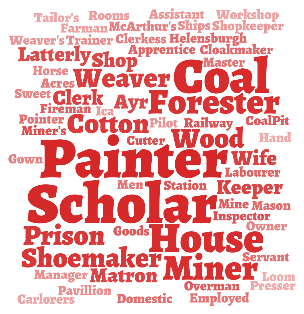
I've found that the men in my mother's family were mainly coal miners in Fife in the 1800s, and that a great-great-great-grandfather held down the intriguing joint role of 'shoemaker & prison keeper'.
Traditional family tree diagrams quickly become ungainly, and major on genetic connections, rather than rarely show the stories of where and how your family lived. I've been writing scripts that display the same data in alternative ways.
Traditional family tree diagrams (say a pedigree chart) illustrate relationships between people, but often these don't tell much of a story. Occupations can be more interesting - they emphasise how today's lifestyles differ from our those of the past.
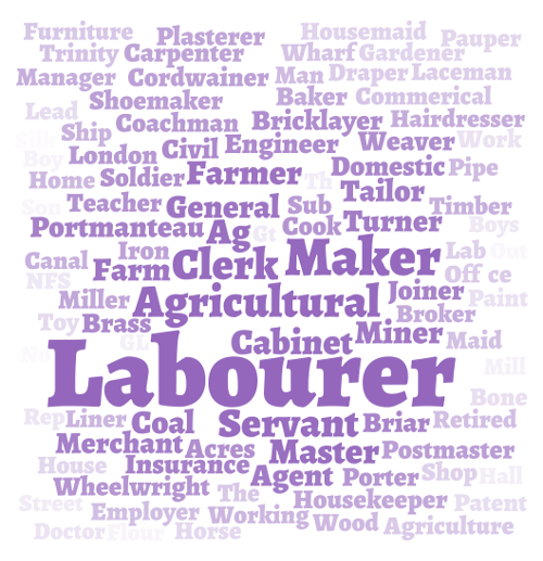
Occupation data can be found in census forms or marriage certificates, and you can quickly end up with a long list of unique occupations. Because each is slightly differently recorded, you can't easily visualise these in a quantitative way.
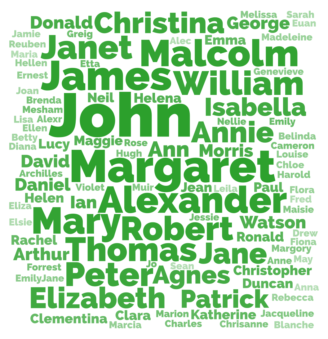
One approach is to make a word cloud by splitting individuals' occupations into separate words and rendering each in different sizes, according to how frequently they occur in the whole family tree:
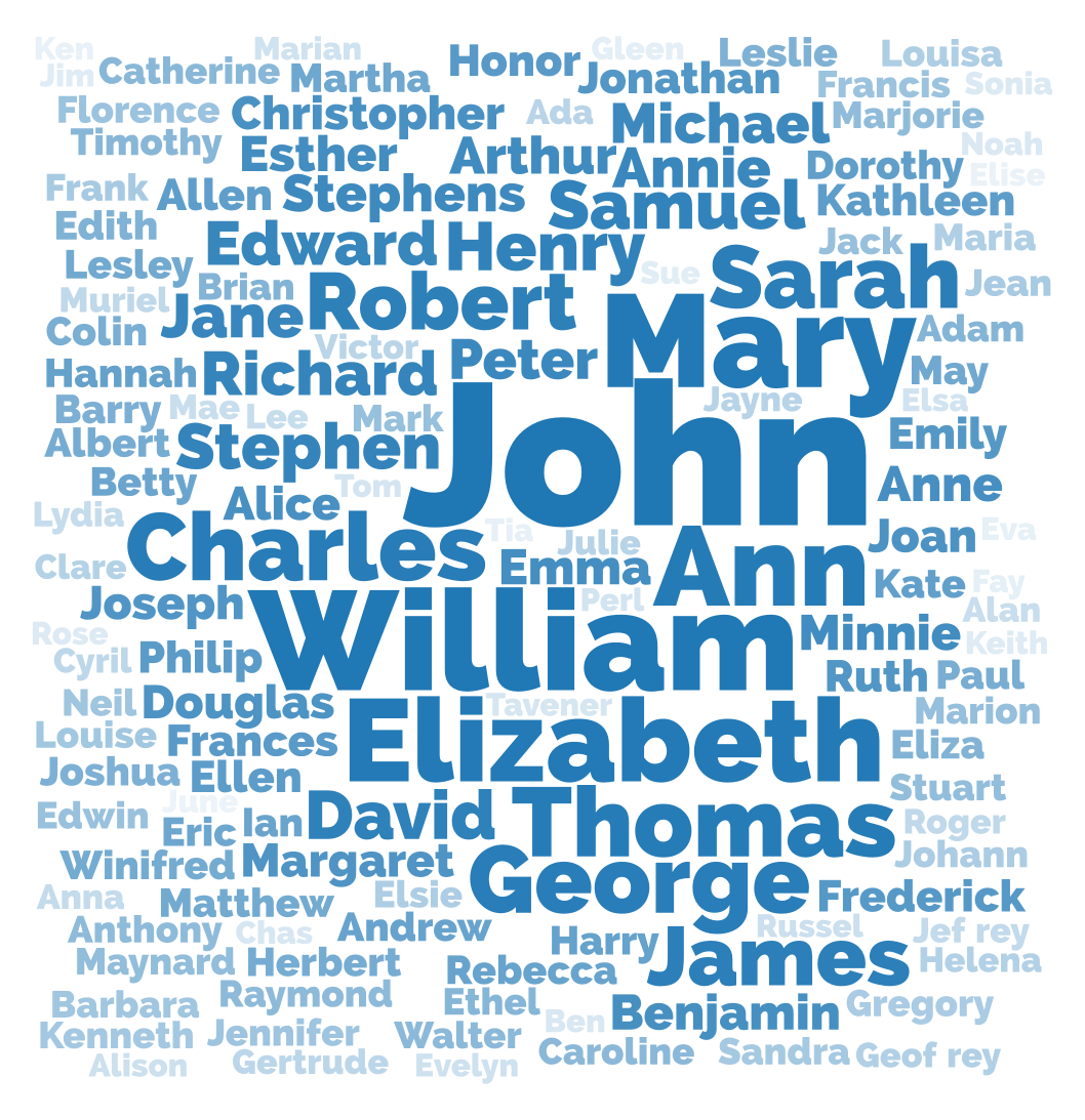
You can take the same approach for given names:
The usability cognoscenti don't really like word clouds (the 'mullets of the Internet'), but I think they're a reasonable solution for data like this.
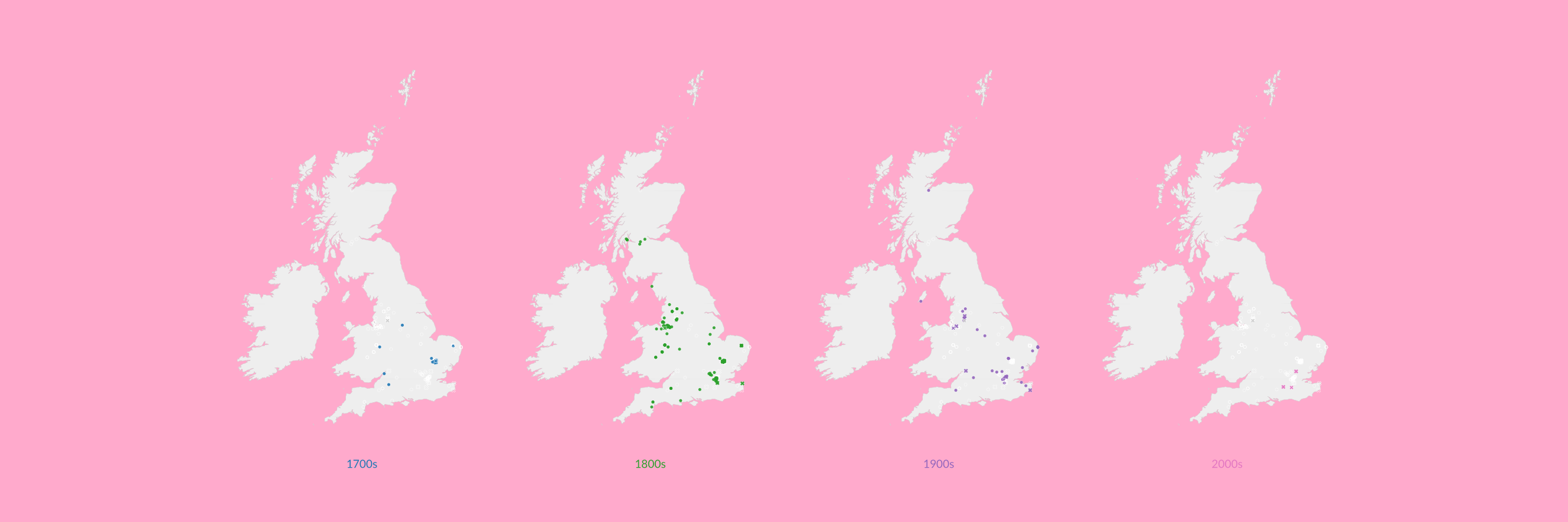
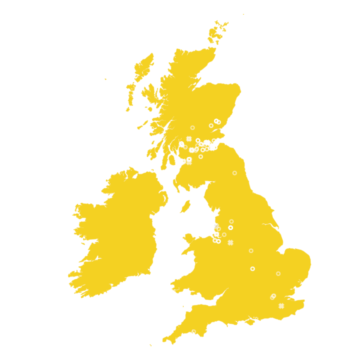
Geographic data (where people were born, got married, lived and died) is also often in family trees, but not readily illustrated in pedigree charts. These usually come from paper certificates written by an official, which recorded the location as text.
Geographic data stored as text isn't immediately useful - say if you wanted to map lots of points. I wrote some software which looks up text placenames in Google's geolocation API, which returns map-able longitude and latitudes.
Here's a quick example (in Node.js) of geocoding the placename data from a GEDCOM file:
if (tree_d3.nodes[i].tree[key].tree[k].tag == "PLAC") {
    requests++;
    limiter.removeTokens(1, function() {
        request({
            url: "http://maps.googleapis.com/maps/api/geocode/json?address=" + tree_d3.nodes[this.i].tree[this.key].tree[this.k]["data"] + "&sensor=false",
            json: true
        }, function (error, response, body) {
            responses++;
            if (!error && response.statusCode === 200) {
                if (body["status"] == "OK") {
                    geo[this.i].birth = {};
                    geo[this.i].birth.lat = body.results[0].geometry.location.lat;
                    geo[this.i].birth.lng = body.results[0].geometry.location.lng;
                }
            }
        }.bind({i:this.i}));
    }.bind({i:i, key:key, k:k}));
}
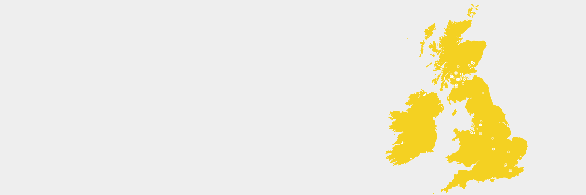
Here's the result, plotted with D3, with rings representing where my family lived, married and died since the 1700s:
Traditional family tree charts focus on relationships, but they quickly become huge and unwieldy when you have a significant number of people - particularly as the number of people increases exponentially with each past generation.
One alternative (which is still a work in progress) is to illustrate relationships on a polar chart, with distance from the centre showing how long ago an individual was born or died - the amount of space increases the further back you go.
Here's an example:
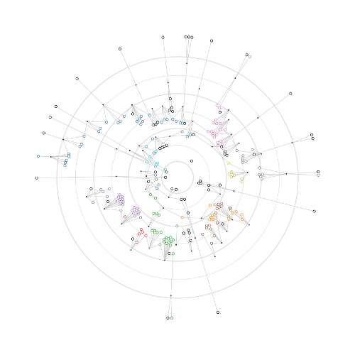
In the above graph, each concentric circle marks fifty years, with the inner ring marking the year 2000, and the outermost 1700.
Individuals are represented by coloured (according to surname) circles, which are positioned by their birth date; those nearer the centre were born recently, those further out lived longer ago.
I think this polar format might scale more readily than a cartesian pedigree chart, but there's still some way to go to make it readable. The next step will be to add name labels.
A quick note on tools and software libraries I used to make the above diagrams. I use Ancestry.co.uk and Gramps to store my family tree data, both of which export data in the GEDCOM file format, as do lots of other geneology programmes.
GEDCOM isn't very convenient to work with, but Tom MacWright has published parse-gedcom, a Node.js tool that converts GEDCOM into the more useful JSON format, creating a JSON object for each individual in the family tree.
Once in JSON, the powerful D3.js javascript library can be used to make interactive data visualisations for web-pages, which includes helpful functions for graph and tree layouts, utilities to scale data and interact with the user.
If I'm preparing a diagram for print, I'll usually export the visualisation to PDF using Safari, then import into Inkscape to lay out a document.